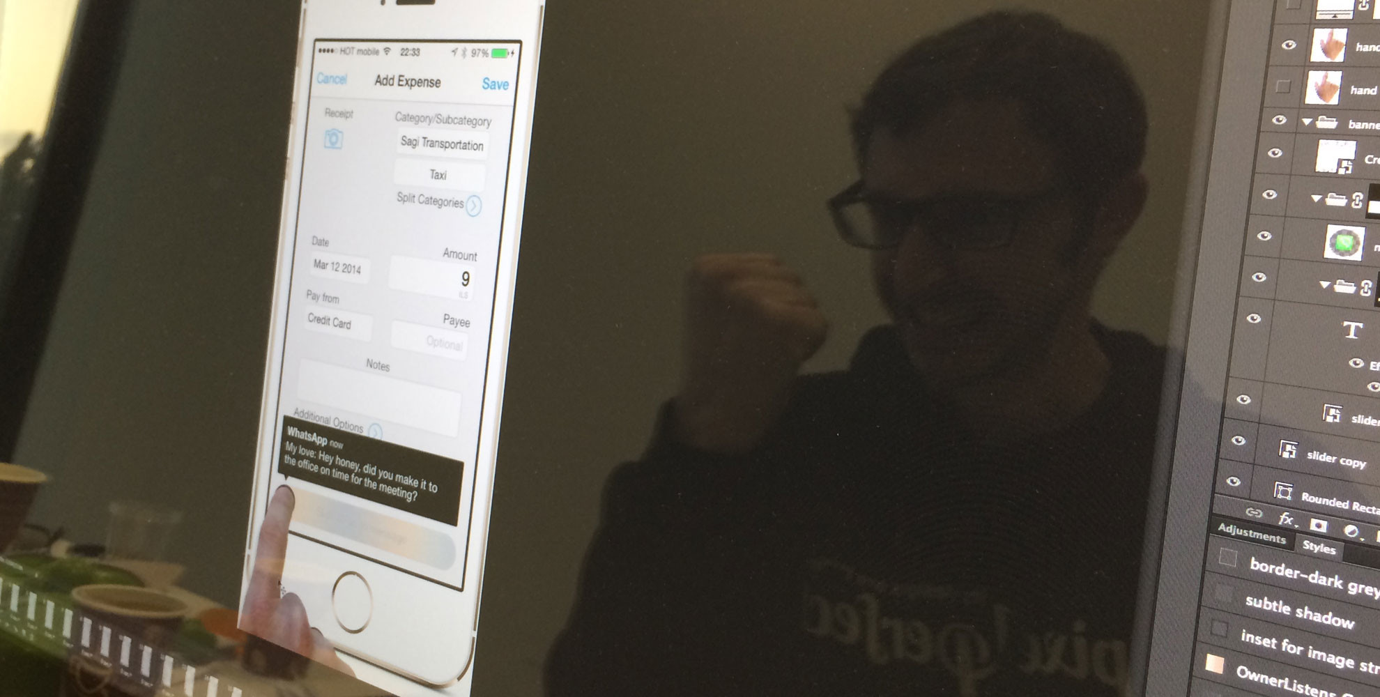
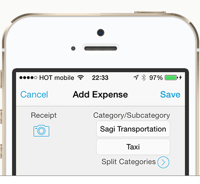
The other day I was in a taxi on my way to a meeting and Whatsapping with my wife while doing some Homebudget work on my iPhone. Suddenly, a stupid Whatsapp notification banner popped down from the top of my screen. It was just when I was about to hit “Save” on the “add an expense” screen.

I accidentally clicked on the notification banner, which launched Whatsapp and took me out of the “Add Expense” screen. I got pissed off so I forgot about answering my wife at that moment and tried to get back to my expense screen. I reached my destination at that exact moment, and forgot to fill out the expense and answer my wife altogether.
Result: Angry wife and holes in budget.
So as I do whenever I’m angry – I open up Photoshop. Well, actually my “sketch more fucking ideas” sketchbook first:

And then Photoshop. Here’s the first outcome:
The problem with iOS notifications
There are two main types of notifications:
1. Alerts (popup) notifications
2. Banner notifications

I don’t even want to get started with the “stop everything and watch me” notifications.
Those we are already familiar with (big difference between “familiar with” and “comfortable with”) since the stone age days of the first iPhone, and they haven’t developed since.
The Alert popups as we know them today
They make you stop whatever you were doing, thus detaching you from your current state of mind. And of course you can’t be so impolite as to to not answer a message shown to you in this royal format.

A simple solution to the regular Alerts popups
If we would have had just a simple “quick reply” field…

A similar solution already exists in Android apps and jailbroken iOS apps. So let’s move on to the real problem.
Banner notifications
Why banner notifications are good:
In our mobile, fast paced, ADD, schizophrenic world these notifications are blessed. They allow us to be alerted while having the choice to: A) Wait it out, B) Slide it up to continue with what we’re doing, or C) Click and launch the app.
Why banner notifications are a bi^$#:
1. They are very hard to slide up. Sometimes it makes you believe that this action requires special super hero skills to get it right without accidentally clicking on it and launching the chat app.
2. Actionable controls are located on the top bar in most applications ( as recommended for iOS design patterns). This is a major UX flaw.
In a world where we are flooded with chat services, emails and other interactions on our mobile phones (FB messenger, Whatsapp, iMessage, emails, Twitter, Linkedin and more) it makes it impossible to use the top bar without interruptions.
My solution
1. Notification below the top bar. I moved the notifications where they are most likely will interfere less. I also took under consideration the top notifications panel and the bottom quick actions panel so the banner action will not accidentally interfere with those.
2. Bigger touch space for our fingers. Designed a bigger touch element to slide up or down.
3. Slide it up or down. No clicking.
4. Giving it some soul (only for UI sake) I gave some transparency and shadow to the banner.
Let’s see it again:

Adding the interactions
Lets add basic transitions and interaction options which will make it easy to get rid of the banners faster and also make interacting with them more intuitive.
Sliding in:
So now you can either slide it down to open the chat service (and maybe it should even -from a certain point on the screen – automatically slide down):

Or slide it up to get rid of it and get back to your task:

The extra mile – a new kind of notification
I don’t know about you guys, but i actually am trying to better my life by focusing on living the moment and not being caught up in the crazy multi-interruptive world we live in.
I’m fed up with all the communication overflow I have from my devices. Lets face it – there are too many of them these days.
I want to live the moment. I want to focus at one thing at a time. I want to live in the present and not let interfaces and OS’s I use take control of my life.
So I came up with a simple concept for a new kind of notification. I call it “Zen Notification”.
* Update: Following this post feature requests were made for jailbreaks and this has started to be developed by Bryce Dougherty (@bd452)! Link to Reddit thread. Updates will be written here as well and also on our newsletter.

The concept is simple:
Don’t stop me from what I’m doing, and don’t give me too much information.
You still know you got a message – but you can finish whatever you’re doing and only then take care of reacting to that message. Also this doesn’t make you feel bad about not answering as much as when you see the actual content of the message.
The interaction with the Zen Notification
Long hold – Show me message
Swipe right – Launch app
Swipe left off the screen – Snooze/”don’t show again until next message”

** Update 14 Apr 2014: Check out the updated design of the zen notification concept! (view this on your iPhone). Tweet this
But what can we do as UI/UX designers RIGHT NOW?
Apple is not going to change this so soon (if you work at apple and you see this – please… please show this to your team and have a discussion about this).
So what can we do right away in order to reduce banner notification frustration around the world?
Well folks, the answer is simple – just add actionable buttons on the bottom.

Summary:
All of the concepts above were brought up as suggestions. I haven’t locked myself in an office with a full team of UX pros and thought it all through, so of course there are holes in this suggestion, but it’s surely possible to polish these concepts and iterate on them to perfection.
With this post I wanted to create a discussion and some food for thought. So if I managed to do that with you — and if you have any other suggestions or feedback — let me know in the comments and you’re most welcome torebound my shots of the original concept or the Zen notification concept on dribbble.
Yours truly,
Sagi
I invite you to Sign up for Hacking UI’s weekly newsletter to receive updates on future posts, and be sure to stay in touch via Dribbble orTwitter.
p.s. I’m uploading these shots also to my dribbble account so you’re welcome to connect with me there as well.