Icons are elements found in almost every place you can think of on the web and on mobile devices. A good designer needs to know how to create icons that are pixel-perfect, clear, sharp and uniform. In this post I’ll give some of my favorite tips and advice on how to create perfect icons.
In this post I’ll share with you the way I work, which I find to be the most comfortable and efficient way to cooperatively work on a dynamic product that’s constantly changing and developing. In this method I create the icons using Adobe Illustrator, export as SVG and convert to icon fonts and implement in our product.
This does not mean that it is the most correct way, or the only way, but it’s a simple method that has been working great for me and the developers that I work with.
The 3 steps to create pixel-perfect icons
Step 1 – Design the icons, accurately size them and ensure you’ve developed a uniform language.
Step 2 – Flatten the shapes and export to SVG.
Step 3 – Upload the SVG and convert to icon font.
Step 1: Creating the icons
Icons are a language. Much like a font, they need to be created with careful thought and planning. Line thickness, filled or unfilled, round or sharp corners, if round, then with what radius, colored or uncolored, color palettes, icon orientation- 3D, flat, cartoonish, realistic, minimalistic or detailed and the list is endless.
![]()
![]()
All of my icons are made on a single art board. The goal behind this decision is to create uniformity among them. Only when an icon is placed next to the others does the theme of the set really become apparent. That’s also when you realize that the icon needs something added to it or that it is missing some important detail.
I create each icon within two frames. I essentially decide that the main mass of the icon will fit within a 16×16 pixel border (can be whatever size you prefer though), and that the decorators and other overflowing content will fit within a 20×20 pixel border. The reason for this is simple: notice that in letters, like the letter “p” for example, there is a line that extends downwards, or in the letter “h” a line that extends upwards, but the main mass of the letter, wide or narrow as it may be, fits within a consistent border. Same thing goes for letters that are wider than that main space, like the letter “m”.
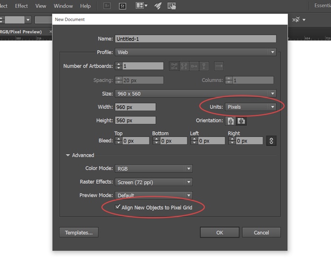
Now in order to set up our work area, we need to check that the units are set to pixels, and that the “Align New Object to Pixel Grid” check box is checked :

We’ll activate “Pixel Preview” via the view menu to help make our icons accurate and pixel perfect. Regardless of the method you use to create your icons, this is essential! You will only notice the pixel Preview markings with a very high zoom level.
The Shortcut:
CTRL+ALT+Y = Pixel Preview
![]()
![]()
Now I use the two frames that I created and put them behind the icons to use as guides, or I will drag the rulers according to the frames that I created in order to make a grid.
view –> rulers –> show rulers = CTRL+R .
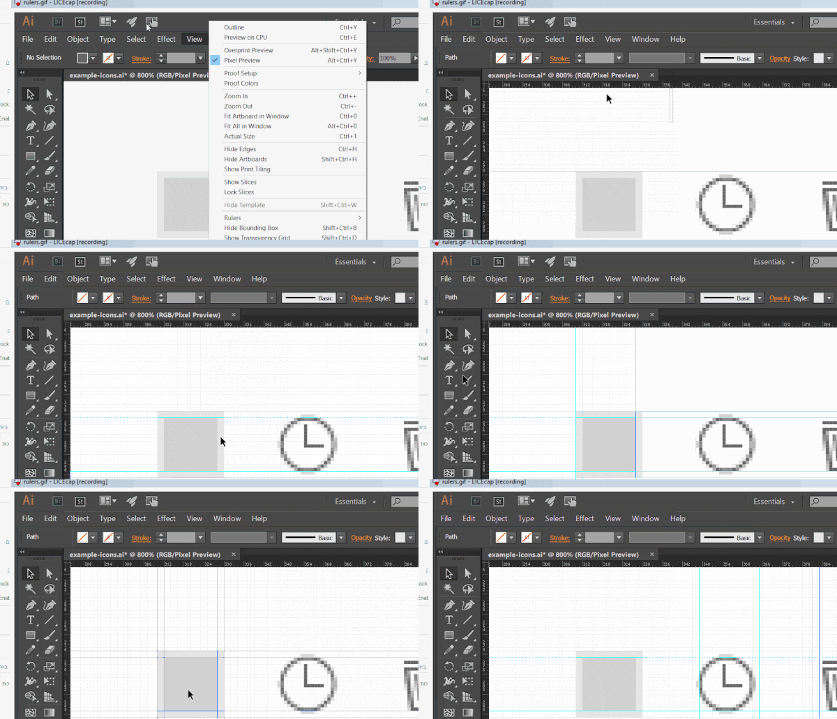

Now we’re good to go and ready to make our icons .
While creating and bringing together our icons to a unified language, it’s recommended to design them at their required size. Yes I know it’s vectorized and the size can be changed freely, but sometimes re-sizing can cost the icon its sharpness because of the relative nature of its parts and thickness of the lines.


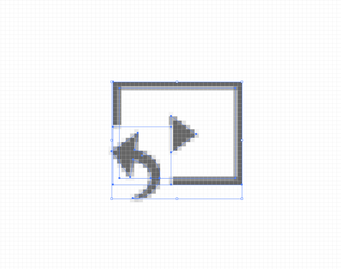

This is why icons should always be created at their final, required size and with point by point sharpening of the pixels.
More useful shortcuts:
- CTRL+1 = 100% VIEW
- CTRL+; = HIDING RULERS
Step 2: flatten and export
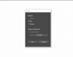
Before exporting, we need to flatten the icon, expand the shapes, and remove unnecessary anchors, in order to join shapes that appear joined but actually aren’t. In short, we want to create the cleanest, and flattest shape possible.
Important tip: Duplicate! It’s very important for the sake of edit-ability of the icons and any future changes that you might make, or even use them for other purposes- Save the original versions of the icons before flattening (non-expanded borders , un-joined shapes, etc.)
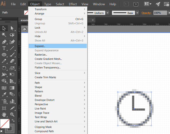

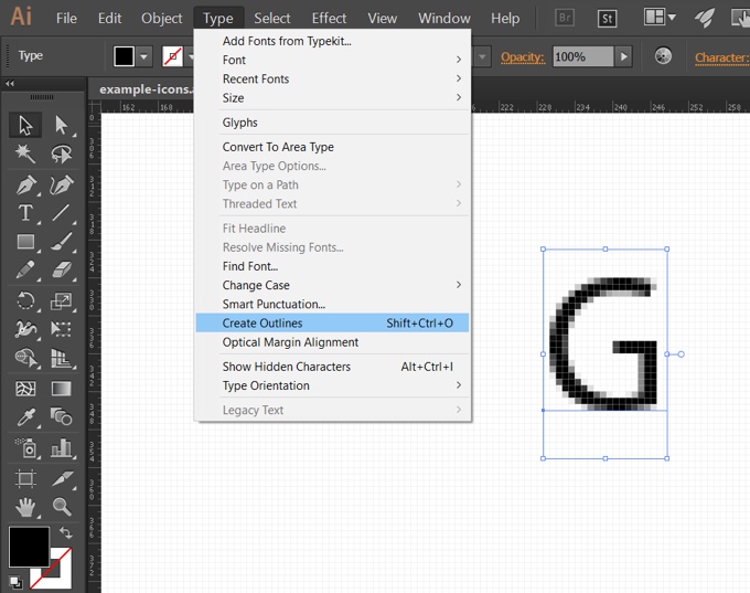

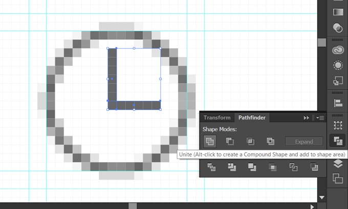

Now all that is left to do it to export to SVG format.
Put the bigger frame we previously used for measuring into the background of each icon by duplicating it. This will also help us stay within our desired size. I also place it there when working on the icon, and by doing so we can place each icon on a separate art board that’s the same size as the rectangle with the click of a button.


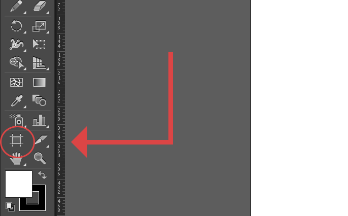

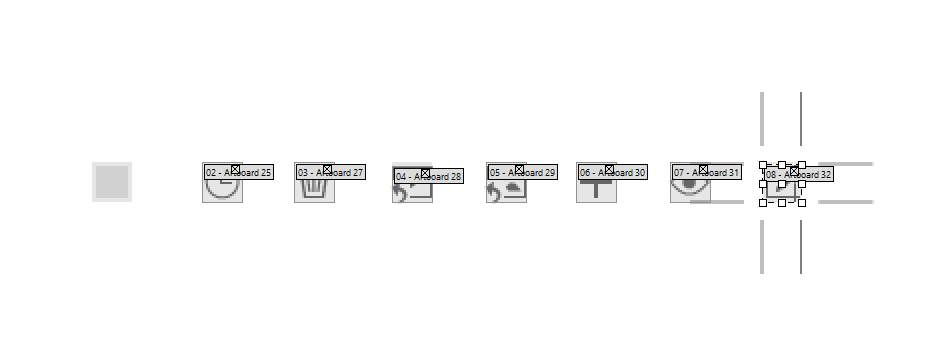

Before exporting erase the rectangle in the background.
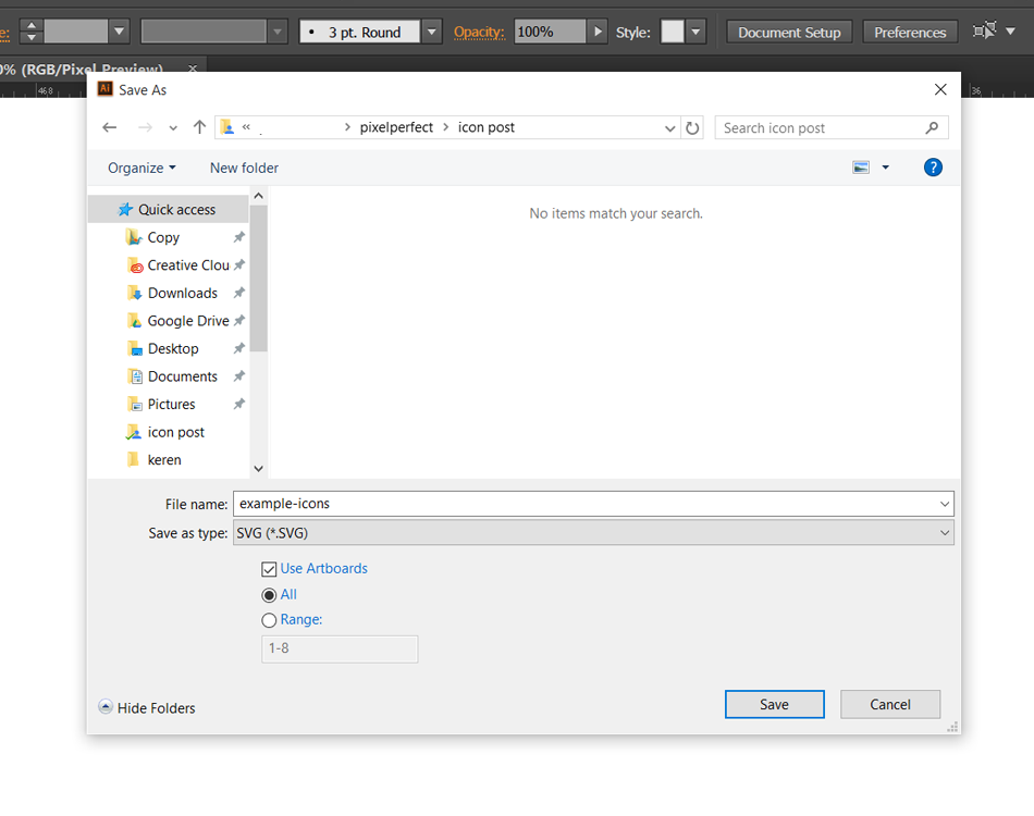
Export all of the icons at once using Print Screen: Save as Type SVG, check the “Use Artboards” checkbox, and select all or a specific range of artboards.

What is SVG?
SVG = Scalable Vector Graphic
- The format uses XML, is vectorized and two-dimensional, which makes it great for interaction and animation.
- It’s also supported in the following all modern browsers (sorry if you’re still designing for IE8).
- It can be edited using Adobe Illustrator, Open Office and Inkscape.
- The SVG format can be modified online: Transform, rotation, scale, stroke, fill & colors.
Step 3: upload and convert to icon font
For this phase the developer or designer takes the SVG and uploads it to the IconMoon, which converts it into an icon font.
Further Reading
I’m really glad to have been able to share my method with you. I’d be very happy to hear about your method as well.
For more understanding of how to create and exporting SVG in a very visual way you can check out the Pixel Icons visual guide.
Also, Icon Utopia wrote a great article about How to Master Pixel Perfect Icons

