Of all the articles on user experience design this past year, Adaptive Path’s PDF manifesto on experience mapping stands out like a Windows Phone at an Apple fanboy convention. Since service design was so hot in 2013 and since many user experience designers were hungry for a new research tool, the Guide to Experience Mapping booklet was an important release for the UX world. Well worth the read (and free!), the PDF discusses the who, what, where, when, why, and, perhaps most importantly, how of experience mapping.
For a detailed account of experience mapping, consult the guide, but the short version goes something like this…
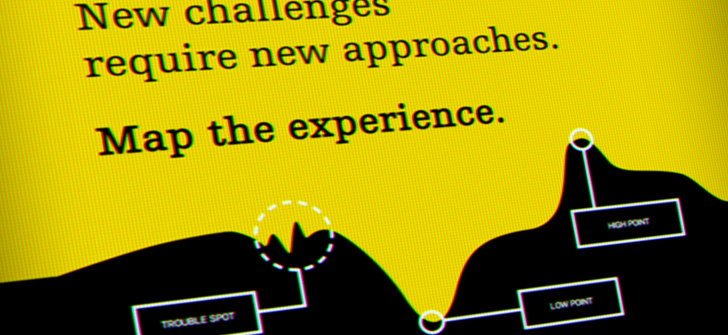
Experience mapping is a way to study and chart customer/user behavior cross-channel and across all the touch points of a product’s lifecycle and then chart this behavior visually. The outcome is a deeper understanding of how emotions and opportunities overlap and what companies can do to improve a user’s experience and capitalize on opportunities.
The Guide to Experience Mapping repeats several times that the act of creating the map trumps the aesthetics of the map so that the “activity” is more critical than the “artifact”.
The guide is expertly written and sheds light on exactly how this can be achieved, but having attempted to use an experience map in a lean framework, rather than on an enormous budget with a massive client, it is apparent that there is room for creating a lean experience map. If the process trumps the artifact, then a lean process is at least a possibility and at best an engaging and important step toward a better product. How then would a lean artifact look? Is an experience map something that should even be attempted in a lean setting? Having tried to create a lean experience map for a client, I can only answer these questions in the way that most experience designers would answer: it depends.
Dan Roam’s book “The Back of the Napkin” was universally loved an enjoyed by designers, entrepreneurs, and researchers alike.  His book gives a framework to something that many of us have been doing for years anyway – scribbling out our ideas in bars and restaurants on the back of napkins to illustrate our thoughts. Roam’s book is a classic simply because it is useful. In the book, Roam talks about reducing enormous amounts of data in to tiny, simple-to-digest pieces of information. He uses the napkin as a both literal and figurative representation of how data should be displayed.
Experience mapping is a deep endeavor and the examples of experience maps online are both visually stunning and profoundly complex. Although Adaptive Path claims that the actual process of creating the experience map is more important than the actual, visual map it creates, Roam would likely balk at the idea that such an important process leads to such a complex outcome.
Indeed, the examples shown across the internet display experience maps that contain so much material that they seem bloated. It is difficult for outsiders to discuss the importance of the actual meeting that led to the creation of the map, but there is are numerous articles and case studies that extol the value of having open, focused dialogues with team members and stakeholders. Lean processes may reduce the time or number of participants, but in general the Guide to Experience Mapping presents a process that could easily be adapted for a lean method. The question, then, is not whether or not this cross-pollination method of work is actually an effective process for lean practices (it is), but rather whether or not the artifact itself is useful if it is so complex.
Could Dan Roam make an experience map using Adaptive Path’s method? This question was nagging me while reading the Adaptive Path guide. So in order to test the idea, I tried to create several variants of an experience map I termed “lean experience map” and the results were promising but ultimately subpar.
To begin with, the missing factor in Adaptive Path’s guide is when the experience mapping should take place in the design process. Is an experience map something you do at the start in order to gain insight as a kind of kick-off to a project? Is it something that is part of a research phase? How about as a kind of hand-off to a stakeholder to show proof of concept? When considering long-term projects with big budgets, perhaps this is less relevant, but for lean experience mapping timing is critical. I’m still not sure when the experience map should be included in a lean design process, and this is the biggest drawback to trying to include an experience map in a lean workflow.
While the process of creating the experience map is supposed to trump the actual map, a lean experience map has a simpler artifact and thus its creation is meant to be “lighter” than the heavy and intensive experience maps from Adaptive Path. Thus, the map itself, while secondary to the process, is still the desired outcome.
From my experience in trying to create a lean experience map for a project, the most troublesome aspect is the artifact itself. Holding a meeting to talk about a user’s experience, product goals, touchpoints, and opportunities, are the bread-and-butter of user experience design meetings with clients. It’s nice to have a large group to discuss ideas and to determine a course of action, but an experience map is meant to guide a project. As an activity that is part of a kick-off meeting, perhaps an experience map would be valuable for any project, lean or otherwise, but for a standard lean project this tool simply hasn’t had enough use to be considered viable.
It isn’t sexy to say but the truth is that there are such a wide spectrum of variables that can make-or-break a lean experience map, that it simply can’t be recommended without serious consideration about budget, time, and desired outcome. Should you try an experience map on your next project? Well…it depends…
Five Steps Toward a Leaner Experience Map
One—Begin with proto-personas (Jeff Gothelf’s book Lean UX is a great resource for this and other lean techniques!). No, they’re not backed by research, but they can still help to expose and explicitly state product goals in an easy to digest format that is crystal clear to everyone in the room.
Start with the product goal as a baseline for consideration and use the proto-persona as a way to try to put yourself in someone else’s shoes.

Three—Now you have a faux user, so write that person’s faux-journey as well. Consider how that person may come in to contact with the list of touchpoints. Will they really come in to contact with each of those touchpoints? Only some? None? When I experimented with the lean experience map for a client, I made a stoplight for each touchpoint and tried to determine if there was a positive, neutral, or negative experience or expectation associated with each touchpoint on the journey.
Four—Consider the opportunities both explicit and hidden that your user could or does have at each of the touchpoints. Opportunities are what will best help to make decisions moving forward, so spend the most time discussing hits and misses at each touchpoint.
Five—Adaptive Paths’ guide recommends using butcher paper for creating expansive, panoramic maps. Just as a goldfish will grow to the size of its bowl, the larger the space for a map the larger and more complex a map will be. Dan Roam’s napkin may be a bit too small, but A-4 turned sideways will help to generate a map that will be useful without being bloated.