
Over the last decade, the term User Experience became more common and familiar mostly to individuals who work with and around digital products.
Whether you’re a designer, developer, or a product manager- we all seem to share the same perception of how the user experience starts and where it ends- on a screen. However, in reality, our experience as users begins quite a few steps before we physically interact with a digital product, and it ends a few steps after we were done interacting with that product. In fact, user experience can be found all around us, and the truth is, that it extends to every product we interact with or obtain information from. Digital and mechanical alike.
In this post, I’ve gathered a few examples of user experience that occurs both on screen, beyond it and some that don’t even involve a screen.
The History
The UX field as we know it nowadays is a relatively new field (in historical perspective), though it has been in the making for almost a century. During the first and second world wars, the field of ergonomics and human factors was emerging, and engineers worked to build user-friendly systems to make machines fit their human operators, rather than the opposite. By rethinking the process of designing and building interfaces with a user-centered approach (whether digital or not), human factors engineers and UX designers are able to make better and more efficient products which are constructed by a delightful user experience.
Los Angeles’ Parking Signs
One example of a bad, real-life user experience is Los Angeles’ street parking signs. Individually, one sign might make some sense, but when they are put together (as often happens) those signs create an overwhelming enigma, so complicated that conspiracy theorists claim that LA’s municipality does that on purpose, to cash in on parking violations.

An interaction designer named Nikki Sylianteng was so fed up with the bad UX of these signs, that she decided to launch a parking sign redesign project called “To Park Or Not To Park?”. The simplicity of the redesigned signs shows how much easier life can be when designing products or information with a user-centered approach.

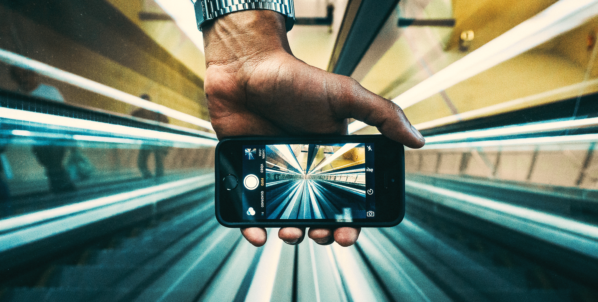
Lyft Redesign
An excellent example of good UX that is hybrid, as it occurs on screen and outside of it, is the Lyft redesign project.
The design team at Lyft understands that as phone screens get larger, it is harder for users to reach the top part of their screen. Since Lyft’s old design contained vital information and call-to-action buttons on that “unreachable” screen area, the primary goal of the redesign process was to reorganize the information in a way that will be more accessible and convenient to large-screen phone users. In fact, by making the app more ergonomic and moving the vital information to the bottom of the screen, Lyft was able to provide its users with an improved UX that extends beyond their phone screens.

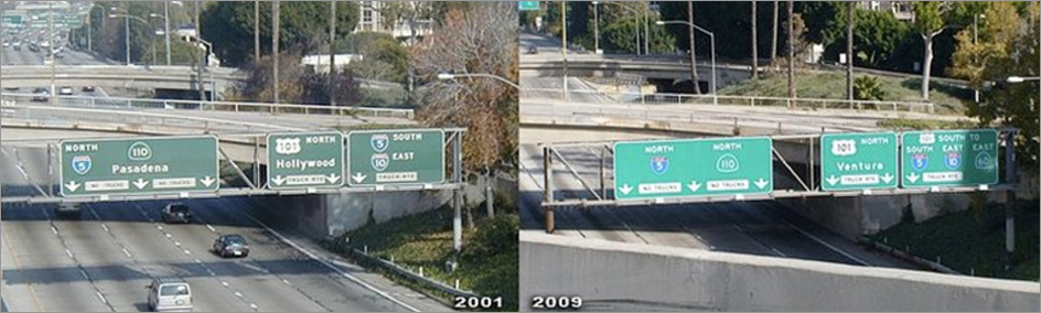
I-5 Freeway Sign
A frustrated LA driver and artist Richard Ankrom was driving on the busy 110 freeway. As he was about to merge onto the I-5 freeway, he missed his exit due to poorly marked freeway signs. Taking the same road on a daily basis, watching other drivers do the same mistake over and over again, Ankrom decided to change the freeway signage, in what he called “a guerrilla public service.” The sign he created was a perfect copy of the official signs, that even CalTrans (who is responsible for California’s freeways) didn’t spot the difference.
Boarding Passes Redesign
This is an example of bad UX we’ve all encountered and unfortunately keep encountering- Airlines boarding passes. These poorly designed pieces of paper miss the one goal they were designed for: providing easy to understand information to already-stressed-out travelers who are anxiously seeking for their flight’s departure gate hoping to get there before the plane leaves.
A designer named Tyler Thompson decided to put an end to this fiasco, and launched a boarding pass redesign project where he offers airlines to adopt his elegant-looking, easy-to-read boarding passes.


Google Now Boarding Pass
Speaking of boarding passes, Google Now does a great job in providing its users with the vital information they need, when they need it. Although this experience happens on screen, I felt it was worthy to mention, as it is a great example of how user experience is not limited only to one app or device. When booking a flight, we usually receive an email from the airline with all our flight details. As shown in the example above, it is sometimes quite challenging to find that information. Google Now recognizes when we have an email with a boarding pass information in it, and the app conveniently presents all the flight details in an easy to read layout. To top all that, they also provide with an airport-scannable QR code.

Airbnb Hosted Walks
Another example of a genius user experience that occurs both on the screen and beyond it, is Airbnb Hosted Walks. Airbnb, which is known for its ‘beyond screen’ user experience, started a project that allows hosts to create a map of hidden gems around town for the guests.
As the user walks near a certain selected spot, a pre-recorded video plays, in which the host explains about the certain spot and tells why is it special. By offering this personally curated service, Airbnb shows once again that the know exactly what experiences their users go through while using their services.

Conclusion
As shown above, the term user experience extends well beyond screens and digital products and it can be found and applied to every product or object we interact with and obtain information from.
User experience is in fact not a practice, but a mindset, and our role as designers, developers, and product managers requires us to stay in that mindset 24/7.
On a personal note, I must say that I am a true believer of empathizing with users before, during and after every project. By understanding why, when and under what circumstances users our app, instead of just how do they use our app, we can create a seamless and meaningful user experience. We must understand that users don’t operate in a vacuum; they have feelings, frustrations, pain points, goals and needs. And as we all know (as humans), these emotions extend way beyond our interaction with a screen. As Dan Norman describes it in his book “The Design of Everyday Things”: “It is the duty of machines and those who design them to understand people.
Further Reading
Getting Inside Your Users’ Heads: 9 Interviewing Tips – UX Matters
How to Create Successful Mobile Experiences- UX Magazine
The Keys to Designing an Empathetic User Experience- UX Magazine

