This week we interviewed Tarver from Gladeye, a digital creative agency in Auckland, New Zealand, about their new website.
Hey Tarver, so what were you guys trying to achieve with the new site?
As an agency hawking digital design services, our own site has to be killer. It’s a difficult goal to track accurately but the reality is that our best metric is a digital marketing manager coming away from the site thinking “OMG we have to work with these guys!” You can infer that sort of emotional engagement with page views and time on site for example, but nothing beats word-of-mouth feedback.
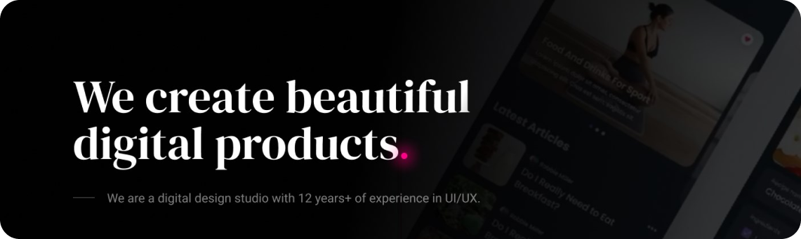
We’d been running a really nice but desperately old Flash site for about 4 years (Flash, for shame!) and our story had changed from web design to full service digital agency. So we really needed to launch a new online presence that better communicated our style and purpose.

How many team members were involved in making the site?
There were between six and 10 of us.
How was the work divided between all of you?
The lead designers were Guy Trowbridge and Tarver Graham with Katie Day and Natalie Lee. The site was expertly coded by William Hamlin and Ken Vu, with Pablo Espinosa on illustrations. All of the team contributed to prototyping, copy, SEO and testing including Rico, Mike A., Mike D., Gabi, Dan, Eddie, Ben, Cole, Alix and Chris.
Did any of the designers code?
Yes, you’ve got to iterate designs in the browser. There’s a huge overlap between design and build. In fact, it’s all design. Take our page transitions – the motion design is crafted in code but it’s just as relevant to the “design” style of the site as the font and color choices.


Did you guys use any tools for collaboration?
We have a pretty fluid workplace with lots of interaction, so beyond a shared file repository and Git for code we kept the process pretty simple. But closer to the launch we used a great bug tracking tool called BugHerd.
Did you execute any UI processes before designing?
We sketched, wireframed, and prototyped. We try to get to the finished product as quickly as possible and use iterative code experiments as a crucial part of the design process.
What tools did you use for design?
We used hand drawn sketches, Photoshop, After Effects and Pixi.js. A lot of design happened in prototypes in the browser. You’ve got to get to prototypes quickly. That’s where the magic happens.
Did you conduct any user testing?
We tested with user groups throughout the design process. Partners (boyfriends, girlfriends and wives) can be really mean, but keep us on our toes. We’ve also continued to iterate minor changes based on analytics and live user feedback.
Where did you get the inspiration for your work?
We’ve worked a lot in film so have always preferred a full-screen “cinematic” approach, ever since the bad old days of full Flash sites. We brought visual storytelling into the homepage with the four “glad eye” image sequences and got a drone-mounted GoPro out to shoot the contact page scene.
I’m not sure who was first to drive animations with the scroll bar – benthebodyguard.com was a fine early example but wasn’t the first. eelslap.com definitely influenced our scrubbing of video clips (actually image sequences) with scroll on the homepage. I’d also love to shout out to whoever was first to cycle page background colors on scroll and to lock a cheeky message underneath the page footer like on our Culture page. Very cool, simple tricks that we don’t mind borrowing.

What was the biggest challenge you faced with the site?
With personal work, often the biggest hurdle is the feeling that it’s never good enough. Perfectionism is the enemy of launch dates. Because we’re a small team we had to fit around the demands of client work so we kept coming back and second-guessing design decisions. The site was in “almost finished” phase for about 6 months before we finally let it go.
What are you most proud of about the finished product?
I’m really happy with the outcome of all the creative assets integrated into a complete experience – video, photography, copy, motion design and illustrations. With the exception of found historical footage we made everything in house and that’s pretty satisfying.
Thanks a lot Tarver!
Check out the site, and let us know what you think. If you have any more questions for Tarver or Gladeye you can post them in the comments below.
You can also catch them on Twitter.
Here are some more sketches from the “in-the-making” of the site: