This is a guest post written by Kinneret Yifrah, Nemala – Microcopy Studio
Note: This is chapter 5 of the book Microcopy: The Complete Guide (Hacking UI readers get it for 15% off with the code HackingUI15).
To you, sending out a newsletter is great both for your brand and for your users: It delivers value to your customers over an extended period of time, keeps them aware of your brand, and develops a relationship with them based on familiarity and trust.
It keeps them up-to-date on new developments, and of course – it sells.
As a result, nearly every business tries really hard to generate a mailing list and distribute a newsletter on a regular basis.
The problem is that however much we want our users to sign up, they don’t. They see it as an invitation for a spam-fest. They need a really, really good reason to ‘risk’ signing up.
Newsletter sign up CTA’s (call to actions) usually appear in a variety of ways: a pop-up displayed when the user accesses the site, or after they have scrolled down a bit, a check box when registering to the site, a form in the footer or on the sidebar, or all of the above.
Tip 1: Excuse me, have we met?
If you display the newsletter invitation pop-up immediately after users land on your site, it is like a complete stranger coming up to them from out of nowhere and offering a relationship. Strange, right?
At this stage they have no reason to sign up. They don’t know you yet, and they certainly don’t trust you.
Invite users to sign up for the newsletter only after they more or less understand what you have to offer them.
For example, after spending one or two minutes browsing the site, after they have read about half an article, perhaps only after they access another article. The point is that you should have some sort of an indication that the users understand what the site is all about, and that you have already given them some kind of value.
Is your call to action boring, bland or persuasive?
Generally, invitations shown today on the Internet can be divided into three main categories:
1. The boring
A one sentence invitation using a well-worn template that can appear on any website, and doesn’t arouse any interest.
Examples
- To sign up for our newsletter, please provide the following details:
- Sign up for our newsletter!
- Sign up here and get our newsletter delivered directly to your inbox.
- Join the [companyname] weekly mailing list
Even if you use such a sentence in a beautiful well-designed pop-up, you need to remember that your users see a dozen similar pop-ups every day, and they need to decide which one they should sign up for.
Why would such a sentence cause the user to give you their email address, something they guard zealously? When was the last time that you signed up for a newsletter with such a message?
2. ‘Keeping you up to date’
Receive updates, be the first to know, stay in the loop and don’t miss out! How many variations are there to the same promise?
Examples
- Do you want to keep up-to-date? Do you want to receive perks and discounts? Sign up for our newsletter now!
- Be the first to hear about our hot offers, new products and exclusive events.
- Why miss a great offer? Sign up for the newsletter.
On one hand, if the users are already on your site, they know what it has to offer, right? And if you offer to keep them up-to-date via the newsletter, they’ll know what will be updated, right? And they’ll definitely want to receive perks, yes?
Well, actually, no.
They know what the site deals with, they generally want perks, and they more or less know about what they will be updated, but all those aren’t enough.
Users see these update invitations as much as they see the first boring category.
The invitation could appear on practically any site, and it leaves the users guessing how they’ll benefit from signing up for the newsletter.
But our users don’t have the spare time, patience, or overview of your business to understand by themselves what you offer in the newsletter and how they benefit from it. You need to explicitly tell them.
3. The persuasive
The invitation to sign up for the newsletter must be exactly like any other sales pitch. Do you want your users to give you their email? Give them a good reason why.
A good reason is one that’s actually good for them. A reason that will add something to their lives, and will change them even if ever so slightly.
Don’t present a general and vague reason that anyone else could have written, rather tell them exactly what they’ll receive in their inbox that is worthwhile and help them overcome their aversion to providing their email address.
If you have created a voice and tone guide (discussed in chapter 1 of Microcopy: The Complete Guide), you already know what your users would expect to happen to them as a result of using your product or service. Use this knowledge to phrase your invitation.
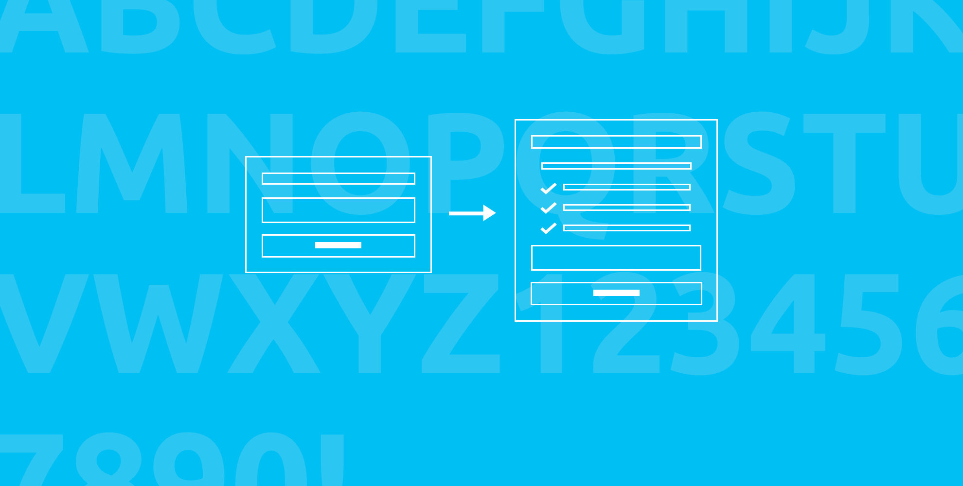
Now, grab a timer, take 15 minutes and let’s make some tweaks to your sign up form, shall we?
1. Change the title (5 minutes)
Sign up for our newsletter or join our mailing list are not effective titles because they tell users that we are asking them to do something (sign up) rather than giving them something. In other words, they tell the users the road they will be taking rather than the benefit they will be getting.
So write the value the newsletter provides in the title, tell them upfront how it will alter their lives.
For example, if your newsletter deals with relationships, instead of writing sign up for our newsletter, write:
Were you told that a successful relationship is hard work?
Make it an exciting adventure!
2. Tell your users what’s in it for them if they sign up (8 minutes)
Only after you get your users interest from your title, can you invite them to sign up and tell them what they’ll receive.
Updates, news or latest offers are not enough.
Be more specific and relevant to your unique brand and audience. What exactly are you planning to send your subscribers?
Naturally you should choose those elements that you think will interest your users the most. A survey with your current subscribers, by the way, is a great way to understand that.
Make sure to offer benefits that users can immediately understand and say:
That’s something I would totally want to learn more about. I’d be happy to receive this.
Continuing with the previous example of a newsletter about relationships:
Were you told that a successful relationship is hard work?
Make it an exciting adventure!
Sign up now for our newsletter, and every week you’ll receive:
- Tips on rejuvenating relationships that you won’t find elsewhere
- Exclusive interviews with leading marriage counselors
- Recommended romantic spots
- and more
3. Remove the obstacles (2 minutes)
Spam is the most common obstacle that stops users from signing up for your mailing list. People will usually consider spam as not only emails that they didn’t ask for, but also too many emails that they did ask for (i.e. yours).
To deal with these two concerns:
- Promise them that the frequency of the newsletter is low, and you can even mention how often.
- Promise that the email addresses are well guarded and that their privacy is important to you.
Tip 2: But we really do only offer deals…
If your newsletter is strictly a sales channel, and simply provides updates about discounts and offers, then first of all you should think about upgrading it to be more magazine-like and include added value, such as recommendations from professionals (“our stylist will turn you into the office star”), an interesting list that you have curated (“the five top restaurants last month”), interviews, success stories, and even in-depth articles.
If you don’t have the time or budget, then at least get into details in your copy.
For example:
- Don’t write “You’ll receive a discount”, but rather “Receive a discount on our new awesome summer collection”.
- Don’t just write “We’ll send you offers”, but rather “Receive special offers for the best rooms in the most sought after hotels”.
- Don’t write simply “Updates”, but rather “Receive updates on new job openings before they are uploaded on the site”.
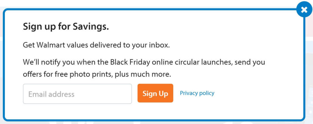
This is how Walmart did it:
Examples
YFS Magazine, a magazine for young entrepreneurs, provides in the title a clear and super-relevant value: superior advice so you can build a remarkable brand. The frequency of receiving the newsletter is clear (weekly), and just beneath the sign up button, the exact spot where the user is debating whether to click or not, they aid in making the choice by promising not to spam.

Barking up the Wrong Tree, a blog that backs everything up by scientific research, offers on the newsletter sign up form:
- Social proof (Featured in + over 290,000 subscribers)
- A value for its subscribers (to be awesome at life)
- Precise frequency (weekly)
- A promise that there will be no spam (ever!)
Even the button provides a trigger to join (see chapter 11).

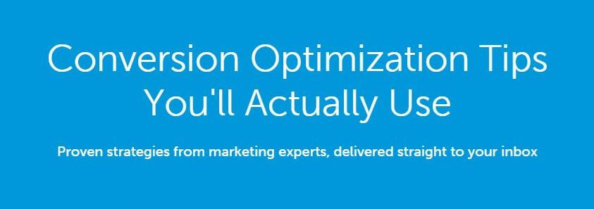
unbounce provides a service for designing, publishing and testing landing pages. If you are dealing with conversions (and that is a high probability if you are reading these lines), you know that we are all searching for tips and practical techniques proven by others to work, that we can simply put into practice ourselves. That’s exactly what unbounce promises you’ll receive in their newsletter.
And finally, the invitation that I like best is from Marie Forleo, the American life coach (by the way, Forleo already replaced it, but it’s still my favourite).
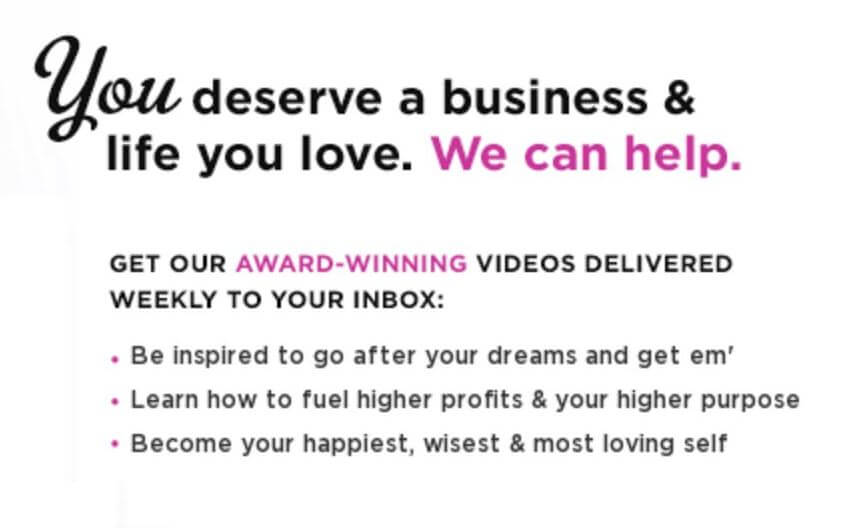
What’s so good about this invitation?
- The title, which offers a precise, super attractive value – We’ll help you create the life and business you’ll love.
- The value is shown, not the act of signing up – The invitation uses words and values that the users are looking for. Forleo doesn’t hide behind long explanations on how you’ll get there, but rather focuses on the ultimate goals, to fulfil your dreams, increase your profits, become happier and wiser, and to love yourself more. Note that the invitation hardly mentions Forleo and her business, but instead focuses entirely on the users.
- The frequency of the emails is clearly stated – weekly.
- There is social proof – Winning an award.
- You can feel Forleo’s personality in every word she writes – Charismatic and sees you as a peer, she sets demanding goals but is warm and empathic, business-like but human and very, very feminine.
In the margins but not marginal
Even secondary invitations to sign up for the newsletter, those that always appear in the footer or on the sidebar, need to be more than just Sign up for our newsletter, otherwise they are not persuasive, and then there’s no point in using them.
Despite the limited space, try to say in a few words what’s in the newsletter, or how it will change your subscribers’ live. State the frequency, assure privacy (this can appear in a small font near the button), and even provide some social proof along the way.
Example
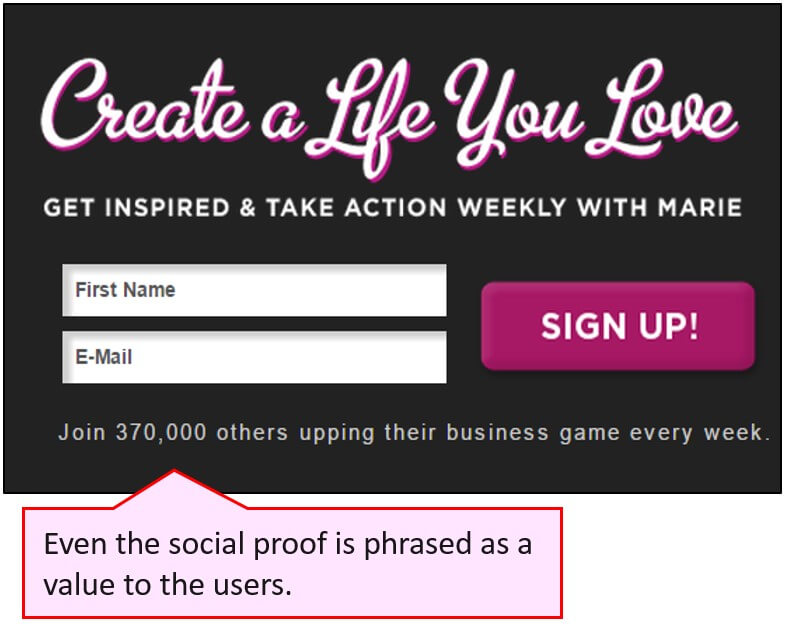
This is how Marie Forleo did it in the footer:
Your new call to action is all set and ready to increase sign-up rates!
Now let’s have a look at some more elements on your sign-up page:
Signing up for a newsletter is like any other digital process.
- Provide text for the button so that it motivates the user to click it.
- Write an excellent confirmation message that will leave your users curious and expectant to receive their first newsletter.
- Invest a bit in writing a gracious error message, in case the user made a mistake when entering the email address.
All of these elements are called microcopy (or UX writing), and are discussed in chapters11, 8, and 7 in Microcopy: The Complete Guide
Be unique, relevant and helpful
Microcopy motivates users, helps them perform tasks, makes them happy, and remakes boring messages into a valuable conversation.
Readers of this article get 15% OFF when ordering Microcopy: The Complete Guide (available in eBook and paperback).
Just enter the code HackingUI15 at checkout.
Download the 15 minute exercise (PDF)
[mc4wp_form id=”60941″]
About the writer
Kinneret Yifrah leads the microcopy (UX writing) community in Israel, and she is the author of Microcopy: The Complete Guide. She has written content and microcopy for digital interfaces for over 10 years, and designed the voice and tone for businesses of all kinds and sizes. Kinneret lectures on microcopy and gives practical workshops for pros in the digital industry.
If you want to start your own newsletter
For the past 3 years, David and Sagi have been creating the Hacking UI weekly newsletter, they managed to send the newsletter on a weekly basis, while growing its audience, as a side project, without missing a week.
The way David & Sagi did it (and still do these days) is by building a set of tools to automate the process of making the newsletter.
Recently the bundled these tools together and created an online course to go with.
This toolkit is called CurationKit, and it’s now on Pre-Sale! You’re invited to check it out!