I bet most of you are like me.
You have a demanding full time job, maybe a family, maybe other side projects going on. No free time on your hands, not to talk about switching your main design tool.
But on the other hand – let’s agree that opportunities need to be taken up on if you think that you could benefit from them in the future.
I think there are still a lot of designers out there afraid to make the big move, but are curious as to how to carry it out. That’s why I wrote this post.
I’ll share my own story, features that made me move, how I did it and how to let go of excuses. Ready? Here we go!
[mc4wp_form id=”25261″]
The Sketch Manuals Series on HackingUI:
Part1: This current article.
Part2: Basic & Advanced Sketch Customization (Plugins, shortcuts, and more)
Part3: My Workflow to Vectorize Any Webpage for iterating in Sketch
Part 4: A Year Using Sketch – An Honest Review
Part 5: How I made a Sketch Plugin for my team without knowing code
*I made a Sketchcast episode out of this post. So to all of you that would like to see this as a video – Here’s the link to Part1, and Part2. Enjoy!
[sep]
Ah, and yeah – this is another ‘Sketch VS Photoshop ‘or if you will – ‘Sketch VS Any other design program’ article. If you’re already a Sketch user, feel free to write what YOU like about Sketch the most in the comments.
Why and how I made the decision
A few months ago I was going to write a post called “How I made Photoshop my bitch”. Actually the draft of this post still exists on our admin panel.
I was a true Photoshop geek. I had all the best scripts and plugins for what I wanted, knew every shortcut and had very advanced workflows I used in UI designs.
But PS was too much hustle (to say the least) and I read some great stuff about the new Sketch 3 that just came out back then.
When I decided I would like to give Sketch a try, before I even clicked the “download trial” button, I had 2 things in mind:
1. My time was limited to decide if I want to buy it. 15 days is not a lot, and I have a goal of reaching a decision in that 15 days time period. Its also a good thing, because it kept me focused on the goal of reaching a decision in that short time period.
2. I was full of tasks in my work, so I never have time for playing around. Plus in my case running two blogs and being a father+husband doesn’t leave one with too much time for experiments outside of the full-time work curriculum.
So I decided to really take this seriously. I jumped head-first right into Sketch.
The first move I made was to prepare a resources bookmarklets folder. I also signed up to Sketchcasts by Rafael Conde to learn by video tutorials about Sketch.
Sketch Resources
Meng To’s Design+Code – http://designcode.io/sketch and I advise you read our interview with Meng To where you’ll find more great inputs and resources.
Sketchmine – http://sketchmine.co
SketchAppSources – http://www.sketchappsources.com
Sketch Tips – http://www.sketchtips.info
Sketch Tricks – http://sketchtricks.com (and also you can follow their Medium collection)
BrilliantSketch – http://brilliantsketch.com
I also made a list and started following relevant people on twitter to get updates. You can follow the Sketch related list on our HackingUI twitter account.
Features in Sketch that make me feel I can never go back to Photoshop
The Color picker
The Color picker in Sketch is a magnifying glass that helps you pick the color with the upmost of accuracy. You’ll always be a ctrl+C away from the color you wanted.


The Color panel
The Color panel makes colors way easier to keep consistent. In photoshop I used to have the color panel with a swatches.aco file. It was convenient to keep consistent that way, but every time having to click the layer panel – on the specific layer – and then moving my mouse to the colors panel, then clicking enter. Really?? come on!
Call me lazy, but in sketch I don’t need to click the layer to change its color. Any layer’s fill and border attributes are at the side window, even with your existing file’s color palette so you can stay consistent with your brand colors while you’re working.
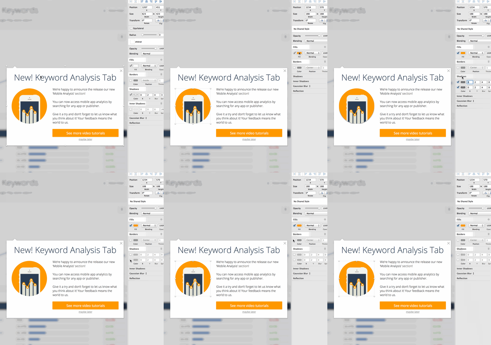

Even better – with a sketch plugin (that has a keyboard shortcut) I can switch between fill and border color. There are also plugins to clear fill color of a shape and to fill the entire background of your artboard. In the same side panel you also have attributes to shadows and other effects. Same window! Not like in photoshop where you have some in the action menu, in an upper panel, in the layers panel and so on. In Sketch its all accessible from one place.
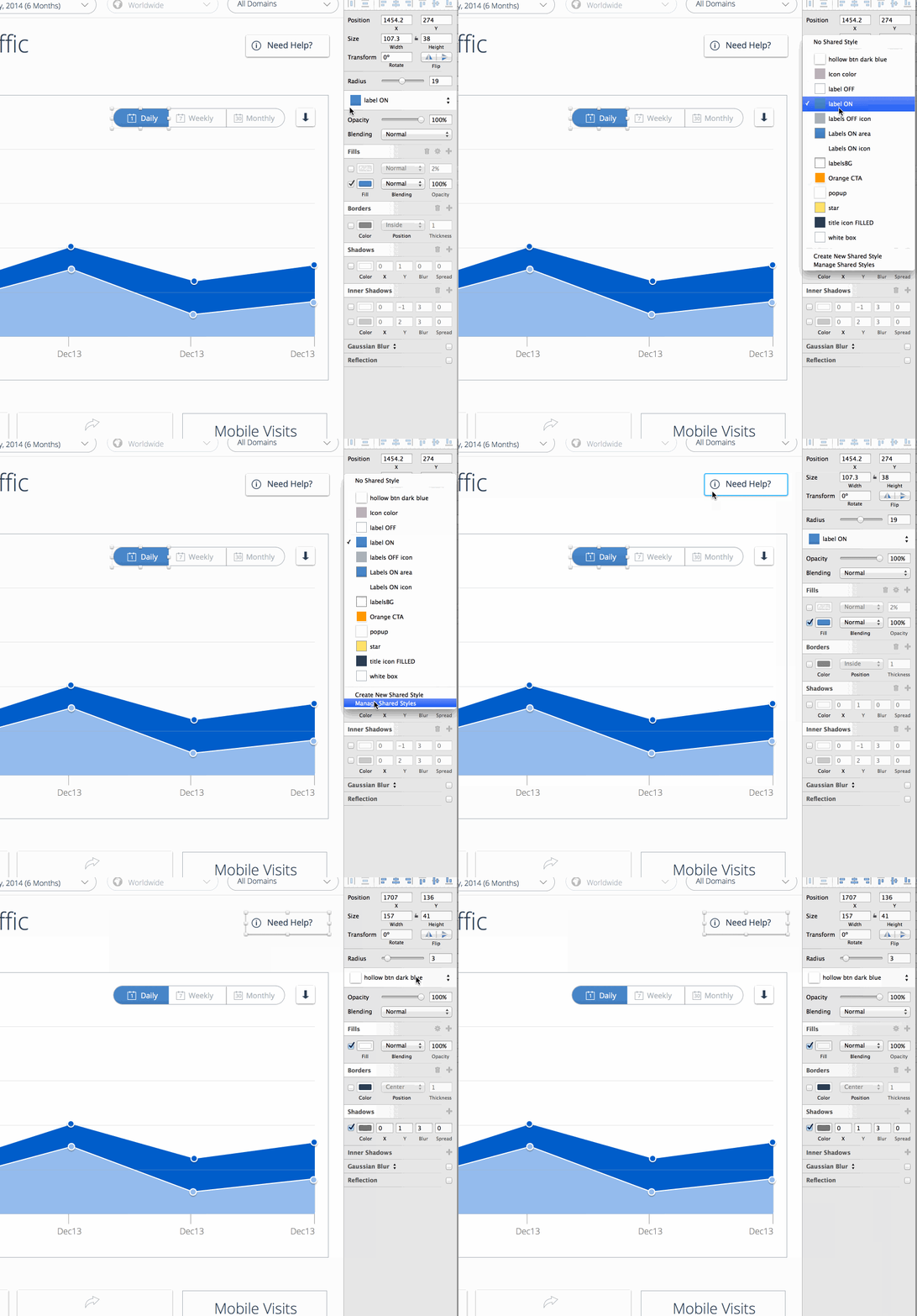
Last but not least, You can save any style of a shape with the “Shared Styles” dropdown right above the fill and border colors. This keeps certain shapes consistent throughout your design process. Change a shape with a shared style – and this will effect all your shapes with that same style on any page or artboard in your Sketch document.

And talking about consistency, this brings me to my next loved feature.
Text Styles that actually work
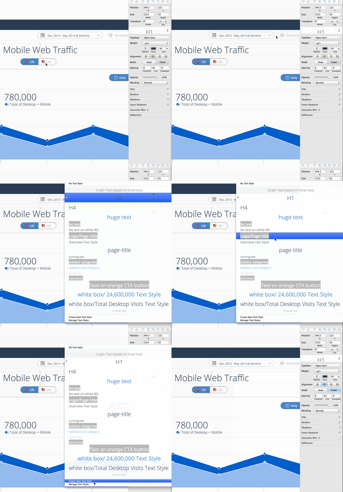
In Sketch the text styles are so light and work like a charm. When you’re working with text, the “Shared Styles” dropdown turns into a “Text Style” panel. Makes it easy to manage H1,2,3 etc and also paragraph texts. Like in the shared styles feature – if you change one text styled word – the rest of the characters with that text style across your whole document will change accordingly. It makes it dangerous sometimes – but keeps you super consistent. I even created a typography styleguide in my document as a seperate page (and I’ll get to talk about pages later on this post).

Resizing complex shapes with rounded corners and tooltips
Every time I resize a complex shape in Sketch I have one of those ”Oh Sketch – you’re so fuckin’ brilliant!” moments.
When you have a rounded corner shape in Sketch or a shape like a tooltip that is made up of two shapes – you can stretch the shape and amazingly find that Sketch will not distort your rounded corners or mess up your tooltip like in Photoshop. And also if you want to edit a specific shape inside a shape – its easily accessible. Just select the complex shape, press enter, then tab to move between the shapes inside it.


Background blur
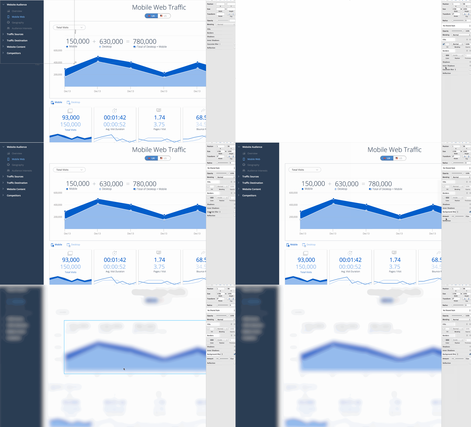
Maybe its just a beautiful trend, but still. When I wanted to create a blurred BG in Photoshop, I needed to create a group ontop of all other layers, select all, copy merged, paste into the group, then go to effects –> blur –> gaussian blur. The real bummer would be when I change something in the BG then I would have to take another screenshot and blur it.
In Sketch, all you need is to create a rectangle shape and give it a “background blur” effect. This will blur the background of whatever is behind it.

Symbols – for any UI element
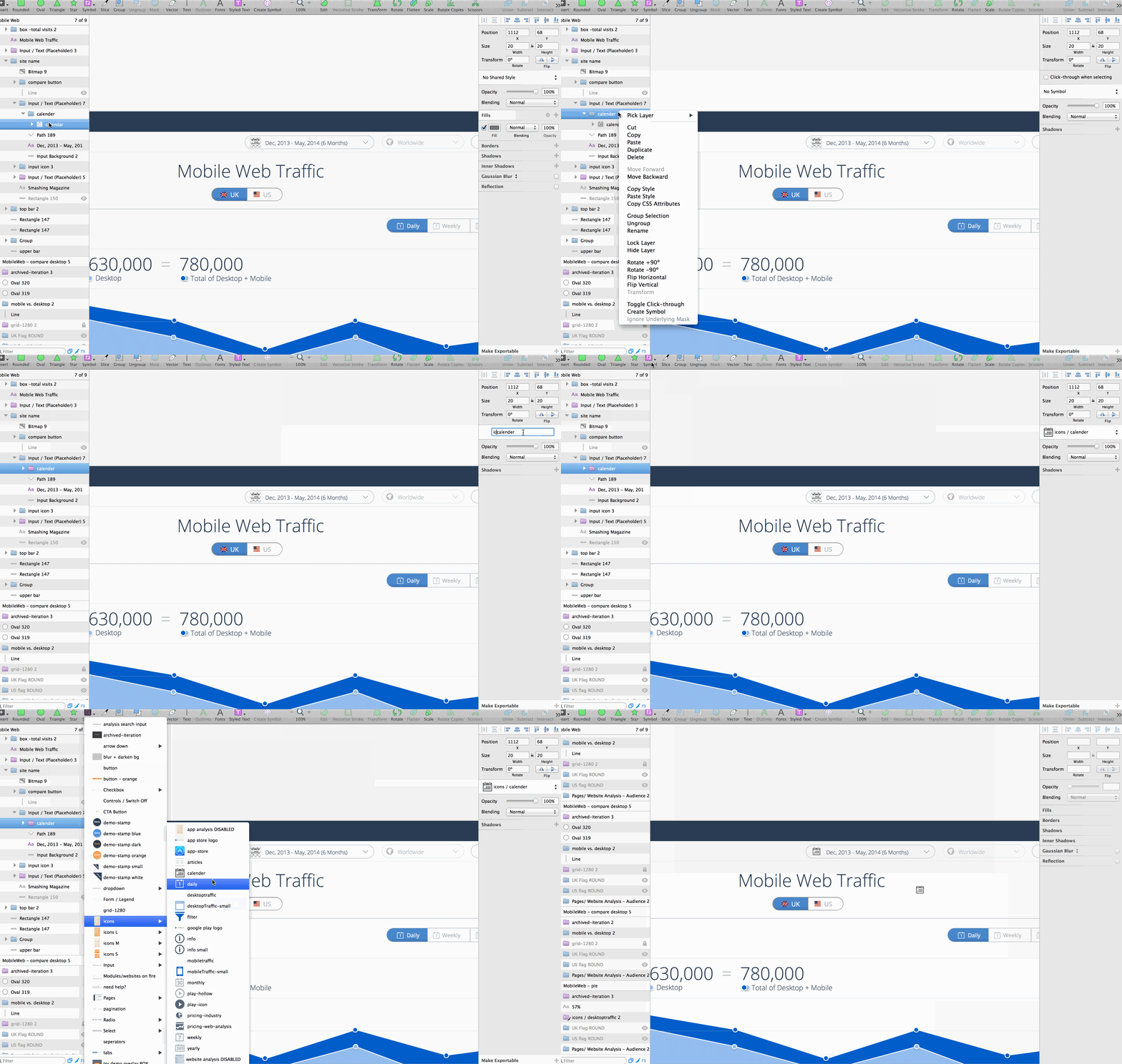
In every Sketch file you have a library of symbols (like in Flash). You can use it for icons, for UI elements such as labels, modules and more. Its just amazing, and you can categorize your symbols in folders by putting a slash (/) in their name. For instance calling you dropdown ‘UI elements / Dropdown open’ and your profile icon ‘icons / profile-icon’.

Export slices easily
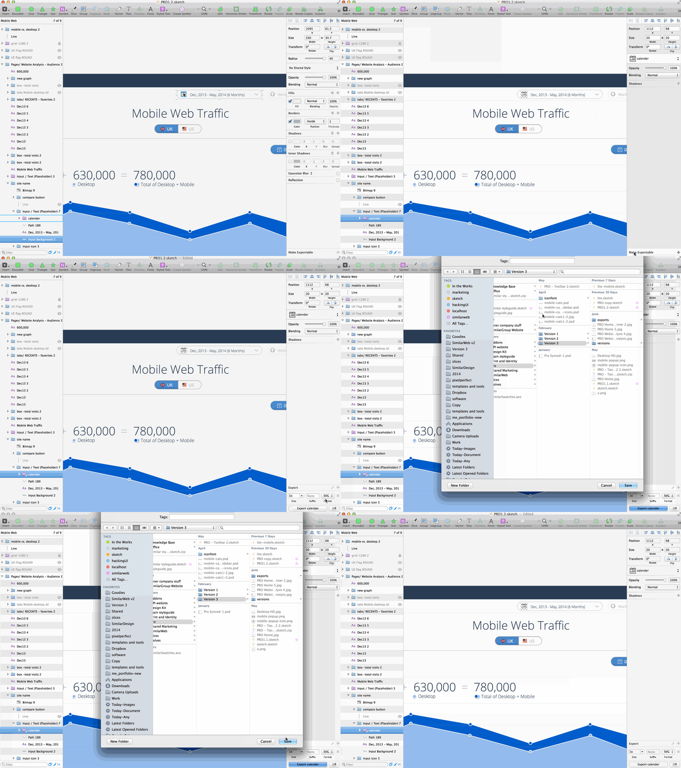
Sketch supports export to JPG, PNG, PDF, EPS, SVG and more. The SVG support is awesome and you can export even complex shapes in a matter of seconds. On any layer, layers group, or Artboard you can simply click the “Make Exportable” at the bottom right and export it in a second.
There is also a slices tool if you’re like to export a certain specific area around a shape.

Save time when exporting screens
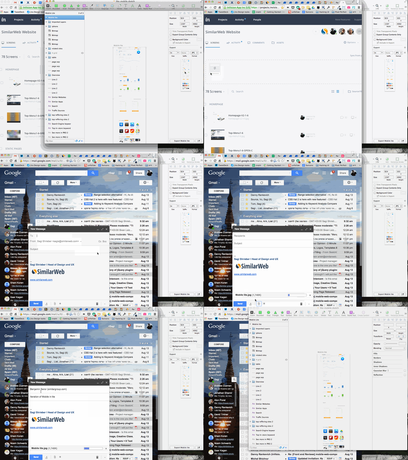
In Sketch you can easily drag any exports from Sketch into any folder or even to your browser (email message/Invision/etc) making it extremely easy and fast to share designs.

Screens as Pages, States & iterations as Artboards
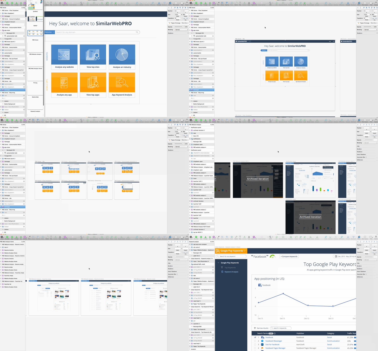
In sketch you can manage a whole project in one file! No more 1GB PSDs or a dozen different PSDs for every screen of your app/site. Sketch files are extremely light-weight.
In Sketch you have Pages (similar to Indesign). Its super simple to create more and with a simple keyboard shourtcut (fn+arrow up/down) or by using the pages popup you can navigate between them.
I use Pages for each screen of SimilarWebPRO, and I have a second Sketch file for the free SimilarWeb site. Just 2 files for a HUGE app with dozens of screens and states.
When I work on a screen and want to try a different variation I simply duplicate the Artboard and continue to work. If I have an iteration that I decided not to use, I have an overlay (that I made as a symbol) that I put on it to remember.
Artboards in Sketch can be also used to show different states of a screen (i.e. open state of a dropdown). I use it by creating a symbol out of every page I have. That way I can duplicate pages on different artboards to and overlay them with the different states.

UI templates make it easy to start a project
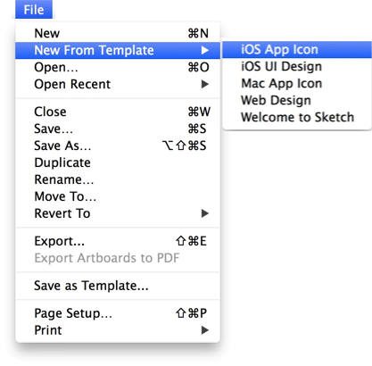
You can quickly start an iPhone app template with ready made UI elements made by teehan & lax, or open a new RWD template that comes with predefined Artboards and web elements.
The best of both worlds – vector work but with layers
Sketch keeps that easy vector Illustrator-like environment with the freedom to move shapes around and manipulate them, but like Photoshop – you’re still obliged to keeping an organized layers panel. So layers and groups have a lot of meaning inside Sketch (unlike illustrator where no one really uses the layers panel).
Sketch gives you that feeling by its big layer panel on the left, and also with the fact that you have to use layer groups to export and create symbols. So groups and layers get the emphasis they need, but you still feel a lot like the freedom of the illustrator canvas.
Sketch is beginning to get more mainstream.
As Sketch popularity grows you can see more and more resources appear and the community around it is of quality and a will to help each other to grow.
A company that listens to its users and actually releases versions quickly
Unlike Adobe, the crew of Bohemian Coding listen to their users and respond quickly. They work in a very agile manner and release new versions of the app way quicker than Adobe would ever do.
Sketch has a couple of support routes. One is by its twitter, the other in a Facebook group, and the third by email “mail[at]bohemiancoding.com”.
Plugins
Apparently Sketch makes it very easy to write plugins to enrich experience and productivity in design. Its based on JSTalk, which is a scripting language for Mac OS X built on top of JavaScript, with a bridge to Apple’s Cocoa libraries.
There are plugins to create user generated content, to create measurement styleguides, to batch-rename layers, and many more (I’ll write about my favorite plugins in a seperate post).
Btw, if you’re designing for mobile there are plugins to sync designs to your mobile device and for framework.js integration.
“But.. But….” – no buts!
“But now I’ll have to convert all my PSDs to Sketch files?”
You’re right, Sketch does not read PSDs. Its part of the price you pay when doing the move, but (and its a serious fucking ‘but’):
1. There are techniques to recreate designs out of existing HTML files. So if you’re working out of have your site You can actually drag-n-drop screenshots from Paparazzi onto a
2. Sketch takes any copy paste from Illustrator, so any vector awesomeness you might have on your PSD can be copied by a PS copy –> AI paste –> AI copy –> Sketch Paste.
3. Its a chance to recreate and rethink your designs in a good way. Hey – If you get lemons you’d better make some lemonade.
“But the developers that I work with only use photoshop”
Its a pain, but Sketch is super easy on devs and also cheap to buy (unlike Adobe products). Plus, send them this and you’ll see them automatically loving Sketch and doing their best to learn it. I actually usually do all the slicing myself. Sketch makes this super easy for me.
“But I heard its still buggy”
Yeah, Sketch is not perfect. Its less than 2 years old (!!!). It crashes every once in a while, but you never lose too much as it autosaves. The team at Bohemian Coding is doing a terrific job of fixing all the bugs and releasing new versions constantly. I’d take Sketch’s bugs and crashes any given day when comparing to the lack of productivity I had with Photoshop.
Further Reading on moving to Sketch
- Design with Sketch, by Meng To
- My first 30 days using Sketch, by Jad Limcaco
- Making the switch – Comments and ideas about Sketch, its place in design, usage and future, by Sebastien Gabriel
Last words
Sketch is a combination of all thats good in Indesign, Illustrator, and Photoshop.
If there’s one thing I can recommend you – is to make the move. Join us in the Sketch community, we’re all enjoying it like hell.
This is only the first part of the series. In the next articles I’ll cover advanced workflows to design with Sketch. Sign up for the HackingUI newsletter if you want to receive the next articles directly to your inbox.
*Update (15 Sep 2014): I made a Sketchcast out of this post. So to all of you that would like to see this as a video – Here’s the link to Part1, and Part2. Enjoy!

